
Your logo is more than just a visual symbol – it’s the foundation of your brand, the way you communicate with the world, and how your audience recognises you. A great logo leaves a strong first impression and is crucial for building recognition and differentiation in the market.
Below, we’ll walk through the key steps of the logo creation process, including research, development, design, testing, and finalisation. Each of these stages contributes to creating a logo that clearly reflects your brand’s values and connects you with your target audience.
The Logo Creation Process
Creating a logo involves several key stages, each with specific actions:
1. Research and Analysis
- Defining the target audience and brand values
- Analysing the market and competition
- Gathering inspiration and references
- Creating a mood board with visual guidelines
2. Concept Development
- Brainstorming ideas
- Sketching initial concepts by hand
- Creating basic shapes and compositions
- Selecting the best ideas for further development
3. Digitisation and Design
- Digitising sketches in vector programs (Illustrator, Figma, etc.)
- Exploring and choosing appropriate typography
- Selecting a colour palette and testing contrast
- The first round of iterations and adjustments
4. Revision and Testing
- Displaying the logo in various formats and scales
- Testing legibility and functionality across digital and print materials
- Gathering feedback from clients and experts
- Final adjustments and design refinement
5. Final Versions and Delivery
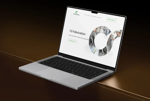
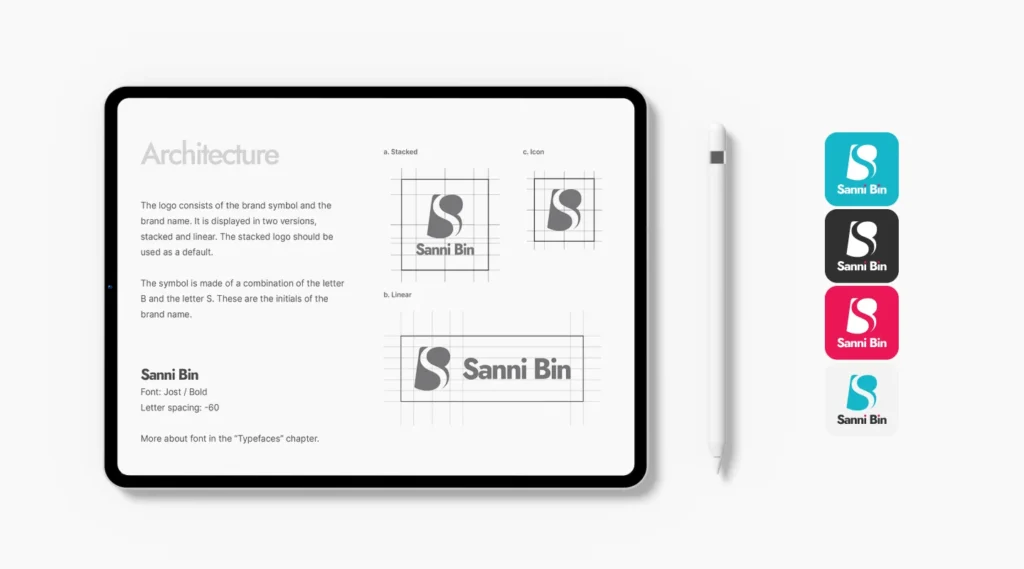
- Creating logo variations (vertical, horizontal, monochrome, favicon, etc.)
- Preparing files in different formats (AI, EPS, PNG, SVG, JPG, WEBP)
- Creating a brand guide with usage instructions
- Delivering to the client and providing training on proper logo use
Characteristics of a Good Logo
A quality logo should be simple, easily recognisable, and adaptable to different formats and media. Simplicity allows for quick identification, while originality ensures your brand stands out from the crowd. An effective logo is scalable, meaning it looks equally good on a business card and a billboard. It should also be relevant – the design must reflect your brand’s essence and values.
In addition to visual appeal, a good logo is functional. It should be flexible enough to be used in various contexts, from digital platforms to physical materials, without losing its recognisability.
Types of Logos and Their Applications
Logos come in various forms, and the choice depends on your brand’s identity:
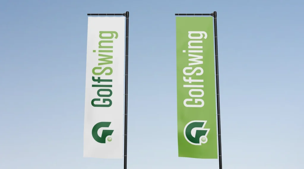
- Wordmark Logos use only typography to represent the brand, making them ideal for companies with unique names.
- Lettermark Logos consist of brand initials and are often used for longer names.
- Symbolic Logos use recognisable graphic symbols to convey the brand message without text.
- Combination Logos merge typography and symbols, offering flexibility in use.
- Emblem Logos contain text within a symbol or shape, giving them a classic and institutional look.
Each type of logo can be customised to suit your brand’s needs, and often, multiple versions are created to ensure consistency across all platforms.
Logo Formats and Versions
To ensure your logo works in all situations, various versions should be created:
- Vector formats (AI, EPS, SVG) allow for seamless scaling and are used for printing and large formats.
- Raster formats (PNG, JPG, WEBP) are applied in digital media.
- Colour variations include versions in full colour, black and white, inverted colours, and transparent backgrounds.
- Favicons and icons are tailored for websites and social media profiles.
- Vertical and horizontal variations provide flexibility for different visual environments.
Psychology of Colours, Fonts, and Styles in Logos
Colours play a crucial role in brand perception. Each colour carries its associations and psychological effects:
- Blue symbolises trust and professionalism.
- Red attracts attention and evokes passion and energy.
- Green is associated with nature, health, and sustainability.
- Black exudes elegance and luxury.
- Yellow and orange bring a sense of optimism and creativity.
In addition to colours, typography also strongly influences brand perception. Sans-serif fonts appear modern and simple, while serif fonts convey tradition and seriousness.
Communication and Consistency of Visual Identity
A logo is not an isolated element – it’s part of a broader brand design and visual identity strategy. It should align with other brand elements, including colour palette, typography, and graphic style. Consistency in logo usage across different platforms builds trust and recognition with your target audience.
When designing, it’s essential to pay attention to visual communication principles. Space, contrast, balance, and symmetry play a crucial role in creating a practical design that grabs attention and leaves an impact.
A good logo is much more than just a visual mark – it communicates your brand’s values, builds recognition, and leaves a strong impression. Investing in a professionally designed logo ensures a consistent and memorable visual identity that will support your business growth in the years to come.
Is Your Current Logo Telling the Right Story?
Let’s create one that does more than just look good — one that communicates your message clearly, connects with your audience, and sets you apart. Get in touch today!